'29 September 2015'
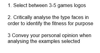
First Task... objectives
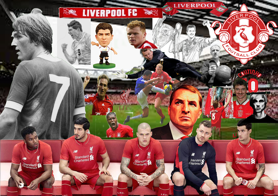
 When I look at this logo my first instincts go to football related, I say that because in the backdrop there is a football pitch, as well as that the 16 on the end of the logo which is filled in a gold/yellow colour it tells me that it’s about being the best sporting/football game around, as I refer gold with the best. This may be a football game logo but it could well be a car company logo too as it has that metallic feel to it. I say magnetic because there is some kind of magnetic outline around the text. Throughout out different Fifa games the Fifa part of the logo has been always a consistent black italic FF Cocon font. |  My next logo falls on Just Cause 2, the first part which hits my eyes is the element of the white scorpion in the middle of the ‘a’ in cause. Scorpions are deadly so I get the impression this game will be quite adventurous and deadly. On this logo there is only two colours which are red and black, some red connotations are blood and violence and a black connotation would be fear, so that gives an indication this game is for the older generation so maybe a 15+. One final point I would say this logo is very beaten up compared to the Fifa 16 logo, as throughout the whole logo there is many scratches which indicate that. |

This final logo which I will be analysing is much different to the other two because firstly I reckon this logo’s target market is for the much younger age range, I got that impression because of the light colour pallet they use. For example yellow symbolises happiness and joy, in my opinion I think when the people were designing the ‘Pokemon’ logo they had ‘Harry Potter logo’ in mind as it looks very much like that but with Pokemon they have made the text and outline of the text more blown up to make it more visual for young ones to remember.
The Next Task...

The Results...


Overview...
Once I had got this task done I was eager to check my work with my tutor and he asked me to scale up the Art it examples to fill the canvas more, so I did that. In my opinion,some of the rock examples don’t scream rock and roll as a theme and again with art it, I imagine a young market would like brighter colours and simple easy to read fonts that scream the theme.
I could have one rock legends logo that is one imagery that has more of a rock and roll theme. To do this I could perhaps use a different font, and choose a different use of color, maybe use a red colour and the make the text more "funky". Alongside that I could add in a electric guitar image.
Next time I could re design the middle orange Art it logo which is not as striking as it is lost compared to the others, and possibly make the last one a bit more colourful as black on it's own looks dull for the young audience to look at and not something they would remember instantly.
When creating these typographic logos I learnt more skills within Photoshop, such as rendering, rasterizing and bulging up the text to give it more of an effect.