'15 December 2015'
My Press Advert (A4) - poster
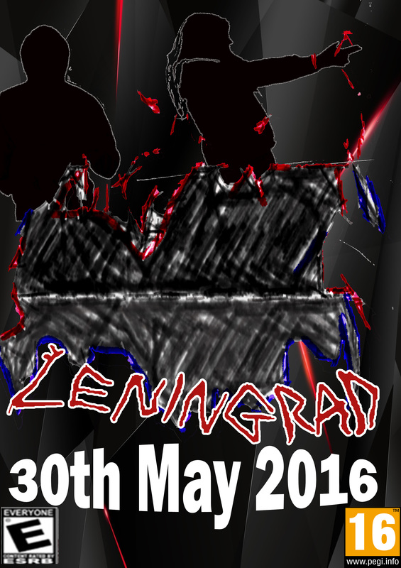
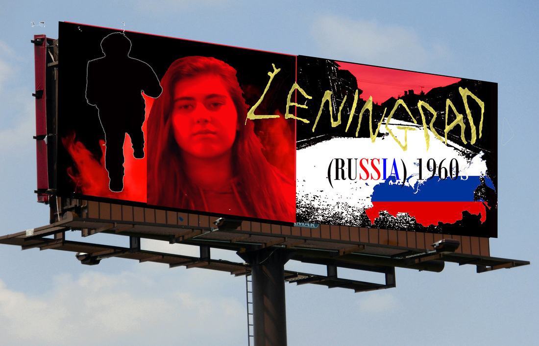
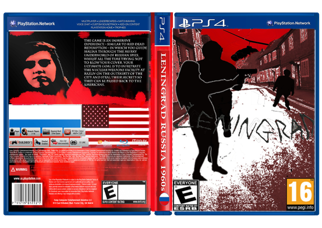
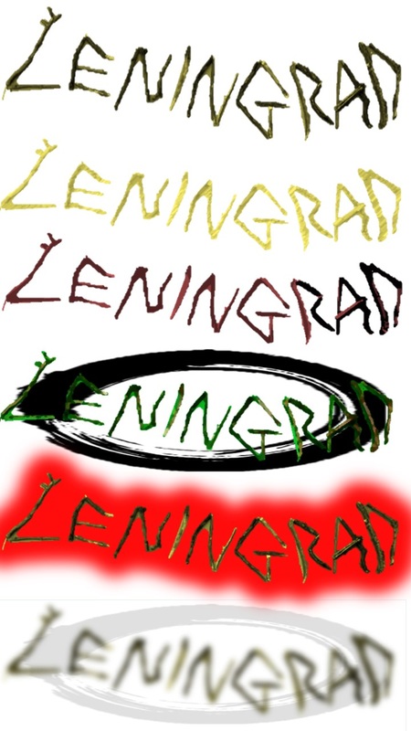
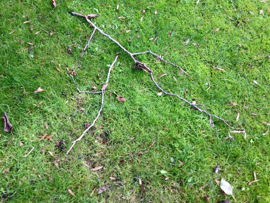
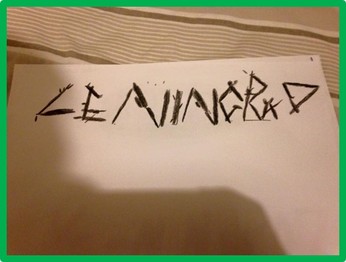
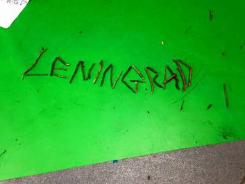
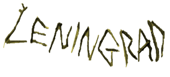
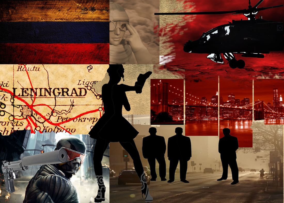
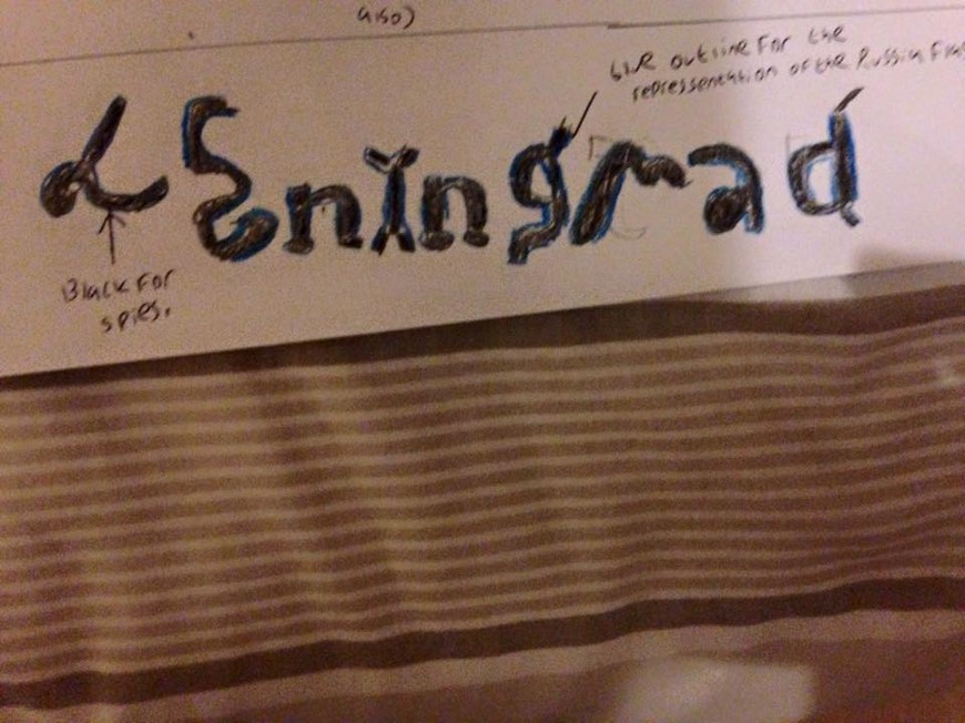
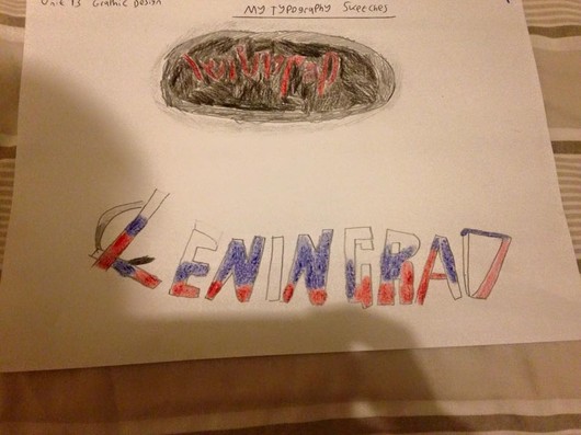
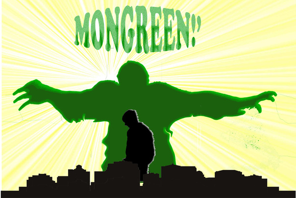
Here is the end product of my press advert. With some even more feedback I went onto act upon this. For instance with the 'Leningrad' title it was a case of color overlaying in red and giving it that white stroke effect. If I am being honest with you by looking at this typography it looks the most professional looking out of all the ones I have created beforehand, I say this because I feel the white gives the text that bold effect.
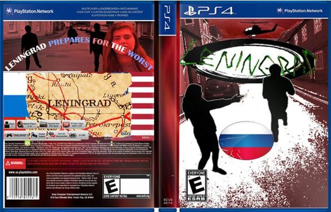
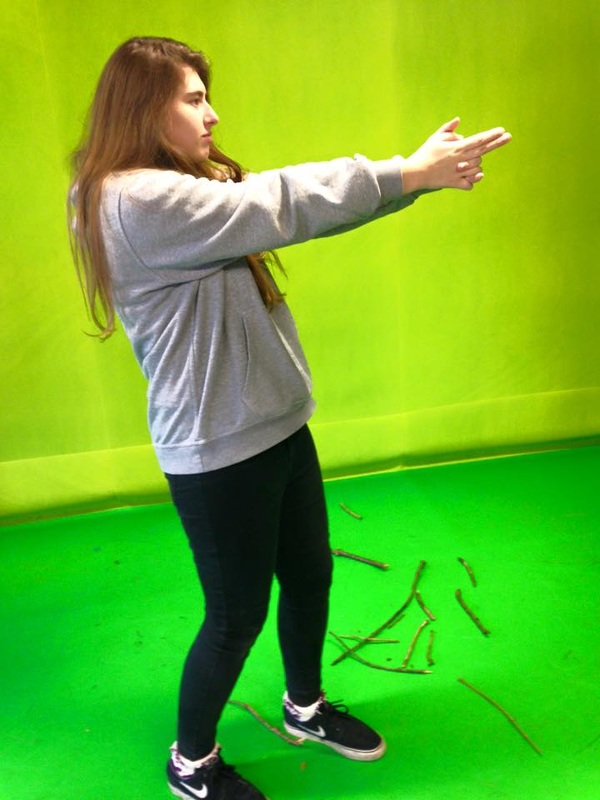
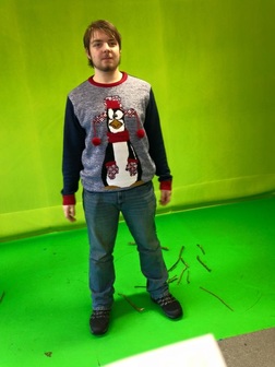
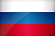
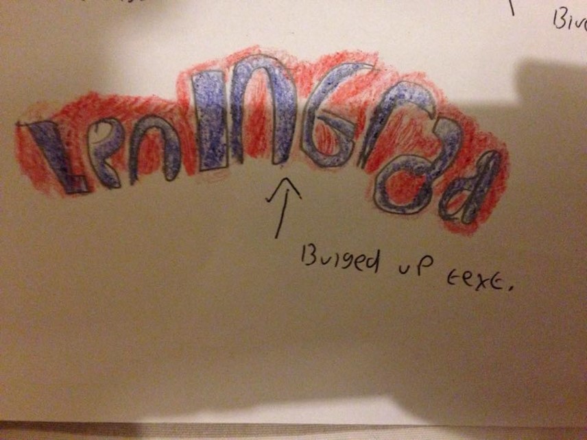
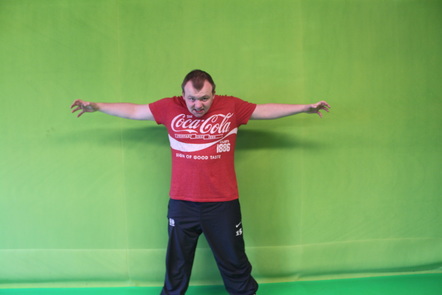
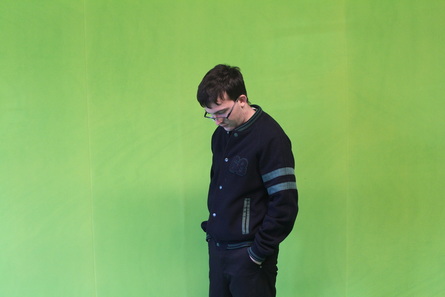
Other tasks involve me making the 'Russian' map into a chalk kind of style, it comes out like a pencil drawing of it. So that the audience are aware this is Russia I got a brush and went over in blue and red. All that was left to do was adding in a release date and making it 'bulge' style, as well as color overlaying the characters (Aaron and Alayna) into black before putting a inner shadow on them both.
Other tasks involve me making the 'Russian' map into a chalk kind of style, it comes out like a pencil drawing of it. So that the audience are aware this is Russia I got a brush and went over in blue and red. All that was left to do was adding in a release date and making it 'bulge' style, as well as color overlaying the characters (Aaron and Alayna) into black before putting a inner shadow on them both.