'17 November 2015'
Pre Production...
THE
MOOD
BOARD
MOOD
BOARD
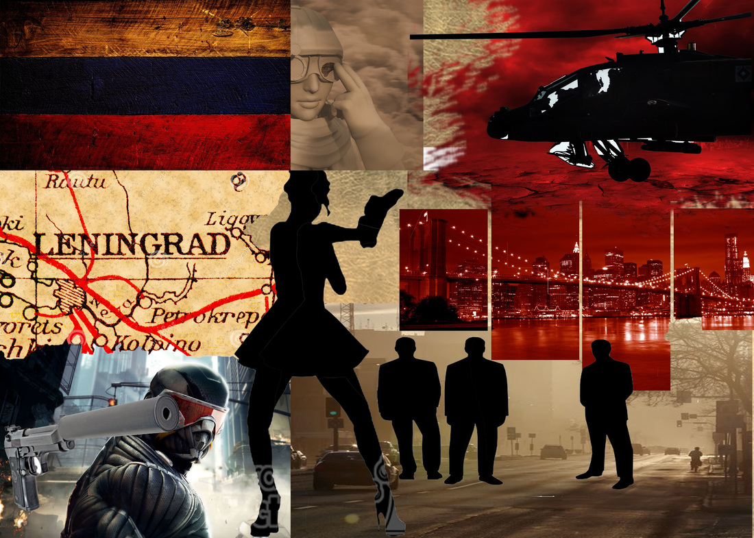
This moodboard is a collection of images which link very well to how I want my work to plan out, as well to show my early thought process and initial ideas.
--------------------------------------
THE
MIND
MAP
MIND
MAP
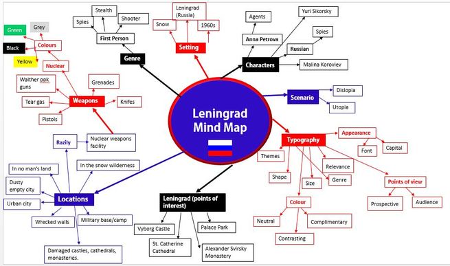
I designed this mind map as evidence to show my early thought process and initial ideas.
---------------------------------------
The Sketches...
(Typography)
(Typography)
 |  |
1 2
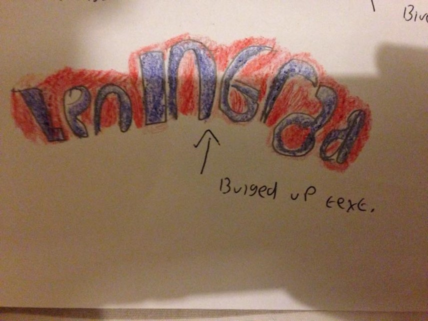
Sketch 1
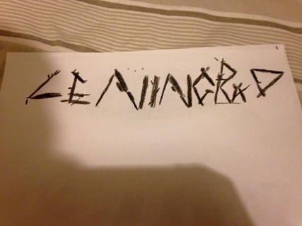
I label this as a simple design which would take not much time in producing as, all it takes is for me to type the lettering of 'Leningrad' in the text box and simply bulging up the text. Like other sketches I wanted to portray the Russian colors.
Sketch 2
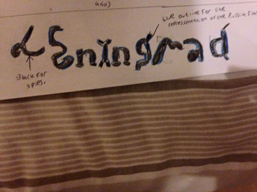
Sketch 2 is slightly opposite due to the different use of colour as, this time I have used a black fill in the lettering to portray the theme of 'spies.' Where the blue is concerned I thought to myself blue goes well with black resulting them being good complimentary colors. One last comment to make is that the letters of 'L' and 'E' have a piece of rope kind of effect .
I label this as a simple design which would take not much time in producing as, all it takes is for me to type the lettering of 'Leningrad' in the text box and simply bulging up the text. Like other sketches I wanted to portray the Russian colors.
Sketch 2
Sketch 2 is slightly opposite due to the different use of colour as, this time I have used a black fill in the lettering to portray the theme of 'spies.' Where the blue is concerned I thought to myself blue goes well with black resulting them being good complimentary colors. One last comment to make is that the letters of 'L' and 'E' have a piece of rope kind of effect .

 |  |
3 4
Sketch 3
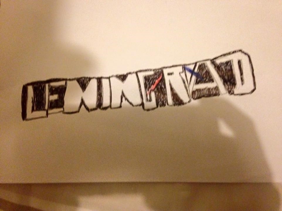
An inspiration from the 'Red Dead Redemption' logo, got me motivated with this idea due to a similar black fill and outline effect to make the text a stand out point. I have used a black pinpoint pen to do this. Where copyright is concerned, I have added in a red and blue line, looking laser like as it lashes through the text meaning the typography has no copyright issues. The colours from the lines came from inspiration of the Russian flag.
Sketch 4
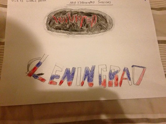
When having discussions with my tutor, I and him both agreed this one has the most potential to succeed! As he particularly like the way the lettering has that twigs/stick effect to it. Straight away when he told me I knew instantly, I would need to collect some twigs and sticks in my spare time in order for me to create this typography. We will edit this on Photoshop.
An inspiration from the 'Red Dead Redemption' logo, got me motivated with this idea due to a similar black fill and outline effect to make the text a stand out point. I have used a black pinpoint pen to do this. Where copyright is concerned, I have added in a red and blue line, looking laser like as it lashes through the text meaning the typography has no copyright issues. The colours from the lines came from inspiration of the Russian flag.
Sketch 4
When having discussions with my tutor, I and him both agreed this one has the most potential to succeed! As he particularly like the way the lettering has that twigs/stick effect to it. Straight away when he told me I knew instantly, I would need to collect some twigs and sticks in my spare time in order for me to create this typography. We will edit this on Photoshop.

5 & 6
Sketch 5
As I analyse these typography sketches, the up top sketch is not as effective to me as, I get the impression the red lettering is lost within the black fill, for example the letters 'N' is very vague to see. It is not all dull and gloom as a positive point is I particularly like the silver glow on the outside to give that more glow effectiveness.
Sketch 6
In a simple analysis of this final sketch, I wanted this to have a screaming out effect to it by having the lettering big and bold! Shouting out to the audience 'this is Russia! Staying with the Russia theme, I have mixed up all 'Russian' flag colours up as well as having some parts darker and lighter shades to it.
In an attempt I have tried to interoperate adding in the yellow symbol on the USSR flag but I don't think it worked as I get the impression the letter 'L' is not the right letter to draw it on. As well as this I colour coded it in a black fill not yellow.