'13 October 2015'
Before photos
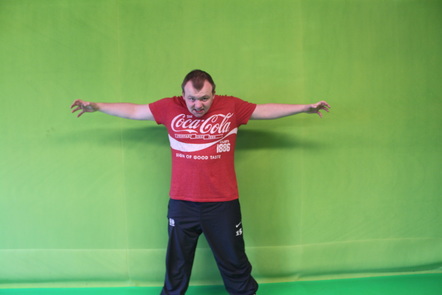
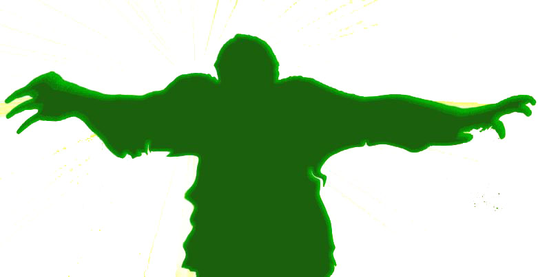
Jay as Mongreen
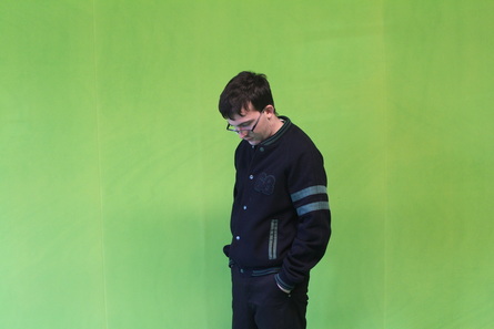
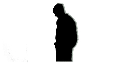
Me as the 'scared' character
After photos
 |  |
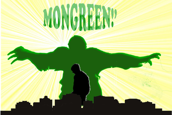
The end product
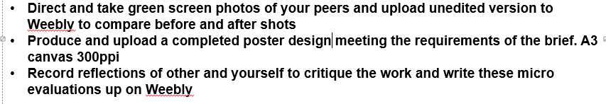
Session task list...
.
.
Overview...
To overview my project I do feel as though my silhouette is a very basic, easy idea with not much thought put into it. I mention this because all I had to do was look at some 'Incredible Hulk' silhouette ideas on the web, to get some inspiration and not use my creative side to think of better ideas. As I was designing my poster I went through very basic Photoshop techniques, for example colour over layering the 'Mongreen' character, to make it a dark green colour.
During the time of creating it may have been applying basic Photoshop techniques but I gained myself a new skill called liquify. The liquify filter lets you push, pull, rotate, reflect, pucker, and bloat any area of an image. So in my case I used the liquefy filter to make Mongreen's muscles, arms and hands much bigger to show he has power and mega strength.
Just as I thought, I had got all my poster done, there was one little issue my tutor wanted me to adjust. The issue what came up against me was an pixel issue with the Mongreen logo because when I transferred it over to my poster it looked very pixelated and that meant it looked horrible to look at and also meaning having to go redesign the logo. I and my tutor were both at the end, scratching our heads in confusion wondering why the original was so pixelated.
