'24 May 2016'
Narrowing the logos down to...

 From (Idea 1) | 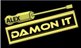 From (Idea 1) | 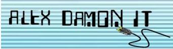 From (Idea 2) |
-----------------------------------------------------------------------------------------------------
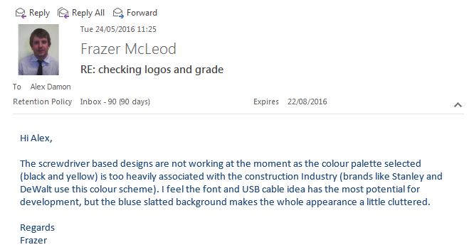
Feedback (from tutor)
(to gain changes and choices)
(to gain changes and choices)
------------------------------------------------------------------------------------------------------
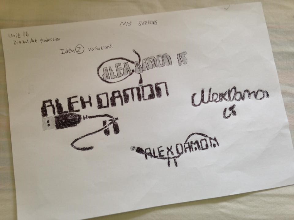
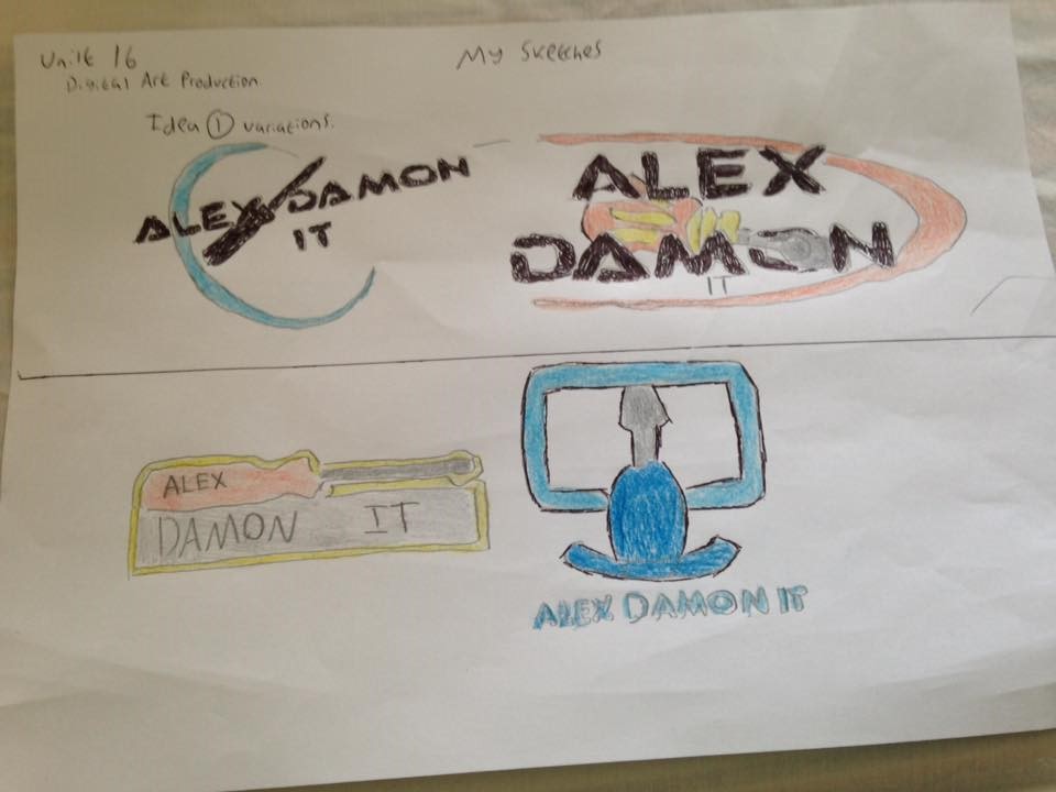
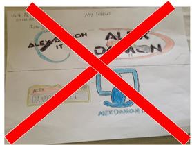
Drawn variations (gallery)
Comments and Feedback
(Kieran Holloway) (friend)
(Kieran Holloway) (friend)
"Idea one looks amazing and by making it black and white is a good decision as it will stand out and it also shows that it's linked to IT due to the text, find and use of image (the cable) really good! And idea two is just as good but I think black and white looks like it suits them more".
"Idea 1 gave me some inspiration for my logo which im currently working on now at sixth form".
"Idea 1 gave me some inspiration for my logo which im currently working on now at sixth form".
-----------------------------------------------------------------------------------------------------
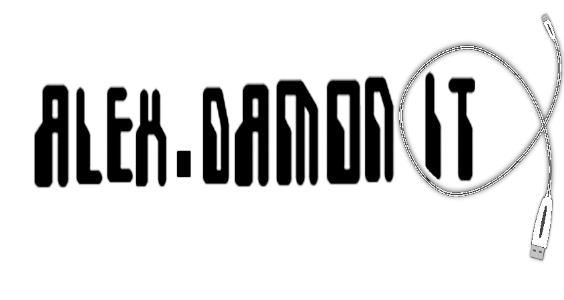
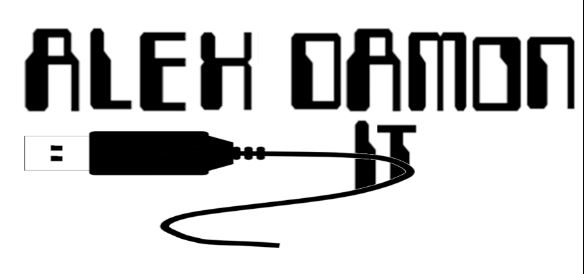
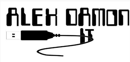
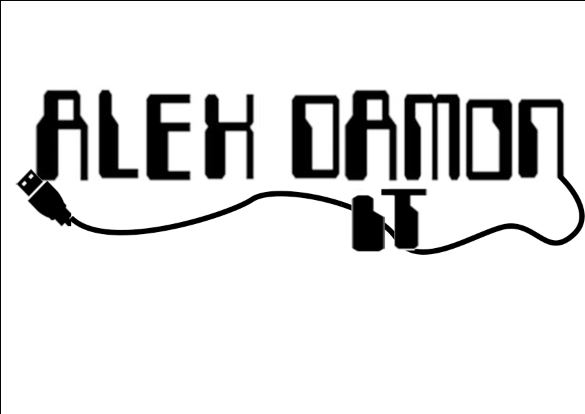
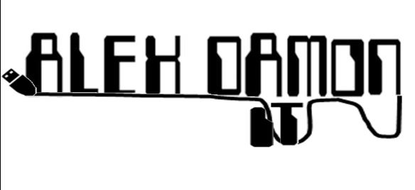
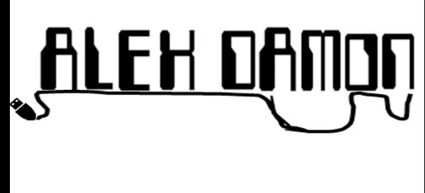
Digital variations (gallery)
Comments and Feedback
(Alex Young and Kieran Holloway) (friends)
(Alex Young and Kieran Holloway) (friends)
"I like the third one, one comment on it though, make the writing like the others, just color it black"
- Alex Young (friend)
- Alex Young (friend)
"So they all look great but the first one has the text that looks abit squashed but still looks amazing with the cable. The second has to be the best one there, it has a bold font that stands out from the white and it's in your face which is great for a logo and the cable looks great. And the third one is good but doesn't stand out as much as the rest"
- Kieran Holloway (friend)
- Kieran Holloway (friend)
-----------------------------------------------------------------------
Where is the idea 1 digital variations???
(Discussions with Frazer)
On Thursday afternoon, Frazer came into the lesson to check each individuals work, so far regarding unit 16. In that time I had he chance to grab Frazer for thoughts on both idea 1 and 2 drawn sketches. He said, "idea 2 has the most potential out of the two, to save any hassle don't bother digitally designing idea 1, as idea 2 is going to beat it to being a successful logo at the end if done to a good standard". It is now time to decide with Frazer out of the three logos I have designed, the best one for the final logo and the one I can develop further in tomorrow's afternoon session.
------------------------------------------------------------------------
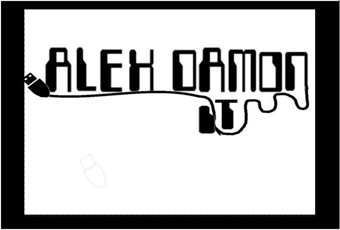
The Decision...
Variations of the final logo)

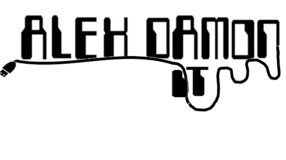
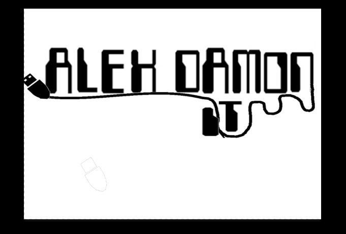
Each sample had to be checked and changed within slight movements. Either the USB cable was too low for the text making it not look underline, or it the cable would not connect with the 'Alex Damon' lettering, for example with the letter 'n'. Different variations for my final logo helped me construct my final logo (found below)
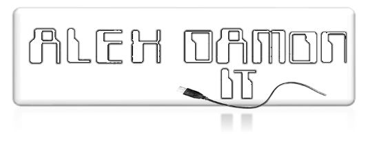
My Final Logo
(For IT Level 3)
(For IT Level 3)
----------------------------------------------------------------------
Comments and Feedback
(Rob Van Den Berg and Dylan Banks) (friends)
(Rob Van Den Berg and Dylan Banks) (friends)
"Overall it looks good. Struggled to identify what industry it is for. I would maybe add some color too. I would suggest trying to keep it as simple as possible".
- Rob Van Den Berg (friend)
"That is awesome mate! However I think you should put a bit more colour, actually no you dont, I dont have any faults with it"!
- Dylan Banks (friend)
- Rob Van Den Berg (friend)
"That is awesome mate! However I think you should put a bit more colour, actually no you dont, I dont have any faults with it"!
- Dylan Banks (friend)
-----------------------------------------------------------------------
