'9 May 2016'
-----------------------------------------------------------------------------------------------------
The Sketches...
(Typography)
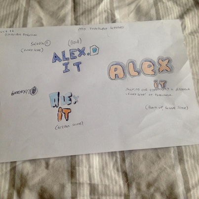
Sketch 1
Audience Feedback
------------------------
------------------------
"I like the 'cartoon style' because it is not to hard going and it seems friendly and a bit stand alone, as in I would see that one and remember it."
- Matthew Patterson (friend)
- Matthew Patterson (friend)
Feedback
"This needs a red background for the one on the bottom left. Wouldn't change anything else though".
- Matthew Patterson (friend)
- Matthew Patterson (friend)
----------------------------------------------------------------------------------------------------
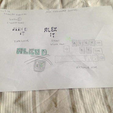
Sketch 2
Audience Feedback
-----------------------
-----------------------
"The 'Type House' and 'Digital Watch Font' stand out for me. Your working with( IT ) and nothing says it more then a writing that looks like stuff you see in a pc of video game. I like the one on the left the most."
- Matthew Patterson (friend)
- Matthew Patterson (friend)
Feedback
"The words would look better in green or blue"
- Matthew Patterson (friend)
- Matthew Patterson (friend)
---------------------------------------------------------------------------------------------------
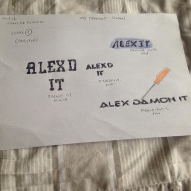
Sketch 3
Audience Feedback
-------------------------
-------------------------
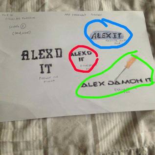
"I like the red and blue one's, they look sort of the same but the one with the back ground looks better but the green one is my favourite one".
- Matthew Patterson (friend)
- Matthew Patterson (friend)
Feedback
"No not for the green one that is good to go I think. The second sketch I would make the letters green of blue with a black back ground. And the first one I would put on a red background"
- Matthew Patterson (friend)
- Matthew Patterson (friend)
---------------------------------------------------------------------------------------------------
Digital Versions
The Two Ideas I am Taking Forward
 Idea 1 | 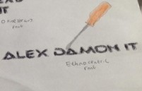 Idea 2 |
Discussions
After having a discussion with Frazer and also receiving some positive feedback back from my friend yesterday regarding these two logo designs, I have decided upon to take these two ideas forward. A common theme was both having 'high potential'. I must now mock up different ways to design this logo by creating a whole page solely on one logo and doing the same again with the other idea. All to be done digitally on Photoshop.

-----------------------------------------------------------------------------------------------------
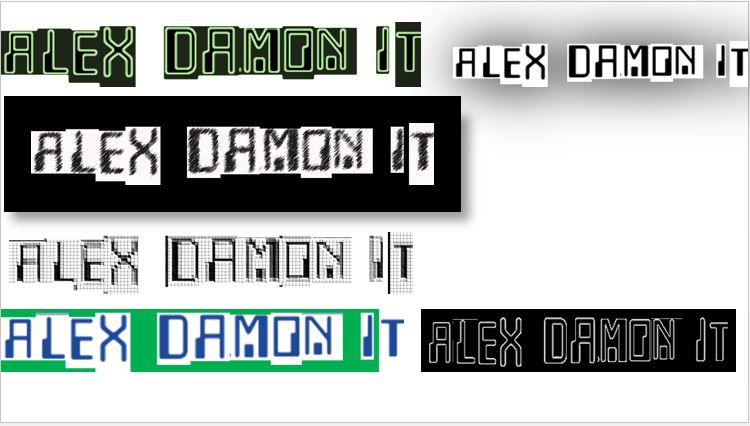
Idea 1: 6x
Feedback
(Frazer Tutor)
"The pixel based old style video games graphics examples have real potential. I would focus on developing the pixel style examples".
(Even More Feedback...)
---------------------------------------------------------------
Classmates Feedback
I
I
V
------------------------------------------------------------------------------------------------
Matt: "Being computer matches well, especially the top left version. The font matches it too".
-----------------------------------------------------------------------------------------------
Justin: "To me the second one down on the left is to blurry for my eyes. Can not stand looking at it for much longer".
-----------------------------------------------------------------------------------------------
Darius: "Green is a good 'techy' color to use. You have used it well with the first idea but not so much for the bottom left hand one".
--------------------------------------------------------------------------------------------------
Alayna: "A black backdrop doesn't work unfortnanly, but I am liking the first logo a lot."
---------------------------------------------------------------------------------------------------
Brandon: "I sense a real computer feel when looking at each and every one of these".
----------------------------------------------------------------------------------------------------
Aaron: "Most of these are too blurry for my liking but if I were to take an idea forward with promise, I would take the first one on the left hand side forward".
---------------------------------------------------------------------------------------------------
Reacting
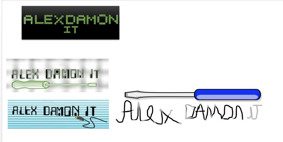
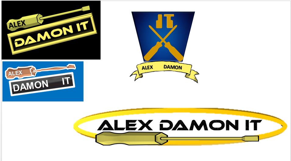
I took into consideration Frazer's feedback and reacted to bring out these new logos. As you can see I have incorporated a gridded backdrop for the green text and a green screwdriver, which is an added feature. I have tried a 'spark' effect for the bottom right hand logo. It sort of works but it probably wont be visible for the audience to see. I think the top left hand logo has the most potential with the text being computer code like and turned into something bold to stand out.
----------------------------------------------------------------------------------------------------
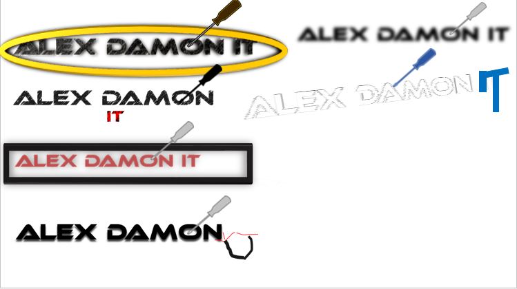
Idea 2: 6x
Feedback
(Frazer Tutor)
"The screw driver based tech ones are not working at the moment. I will try and give you some more feedback in person".
(Even More Feedback...)
----------------------------------------------------------------
Classmates Feedback
I
I
V
--------------------------------------------------------------------------------------
Matt: "The screw driver is a good touch to the logo itself".
--------------------------------------------------------------------------------------
Justin: "I like the gold ring round the first one. Possibly center the text more."
--------------------------------------------------------------------------------------------------
Darius: "The last logo on the right hand side is 'ghostly' like. Get rid of it, I can't see it".
----------------------------------------------------------------------------------------------------
Alayna: "Last two logos on the right hand side are not working for me. Either to invisible or blurry".
------------------------------------------------------------------------------------------------
Brandon: "For all I know it could be a maintenance/vehicle logo from the screwdriver".
-------------------------------------------------------------------------------------------------
Aaron: "I do not know what you are trying to imply with the screwdriver but it looks like a logo an electrician would have on their website".
---------------------------------------------------------------------------------------------------
Reacting
Like I have stated in the 'reacting' part, I have gone to the classmate feedback and Frazer's feedback mainly to produce these fresh new logos. Being a football fan came hand in hand here as the logo at the top on the right hand side, looks very identical to the West Ham badge, however research was needed for the bottom left logo. This came from my logo research earlier on in the project. (The Ncix Tech Tips logo)